Most website designers make silly website redesign mistakes that cost them money, web traffic, and much more.
I am wondering if you are one of them?
A website redesign is not a small task. Everyone’s contribution is required to make a perfect website including the team of developers/IT, design, marketing, and sales.
Even though team works together but still some simple website redesign mistakes often overlooked.
What are the common website redesign mistakes?
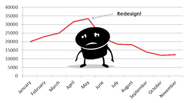
Many people have experienced their SEO ranking affected after migrating or redesigning their website.
Most of them never know the exact reason why their website’s Google ranking dropped suddenly?
What mistakes they made during website redesigning?
In today’s post, I’ll share with you a simple website redesigning checklist that you need to know to avoid silly website redesign mistakes and save your website’s SEO ranking.
Mistake #1: Redesigning website without having a blueprint of a new website
Would you ever build a house without having any blueprint of your new house?
Of course, not.
Because you understand, how much time and money cost to build a house.
Your website is similar to your new house, in fact, it’s your asset that’s going to provide you profit in the future.
And, I don’t think you would dare to take a risk that make your hard work’s result zero because of a full-proof planning.
Following are some points you need to consider before your start redesigning a website:
- Note down all the things you want to add to your new website
- Backup your existing website’s dada before any changes
- Write down if you want new contact form in your new website
- Create a favicon
- Note down the forms you need to your new website
- Your business information
- Easy to find contact forms
- Social media icons for social sharing
- Subscription invitations
Make a list of all items that you want to see in your new website.
Therefore, it does not look incomplete after redesigning a website.
Mistake #2: You didn’t research about your target audience
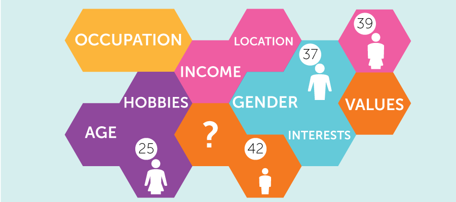
It is one of the common website redesign mistakes, I see people often do.
People build a website without doing a proper research about their target audience and hope that it’s going to provide them success and revenue.
But at last, they ended up with nothing.
If you don’t want to be on the list of those people, make sure you do some research about your audience before building or redesigning a new website.
Consider doing a complete market research about your audience and target market including keyword research and community mapping.
In fact, it should be the first step of your website redesign process.
Once you have all the information, you can use it later in your new website.
Getting statistics and doing market research will help you a better understanding of your market, your clients, their needs as well as provide you insights about your competitors.
All those facts will let you know what currently working in your niche and what has worked in the past?
Build a list of pages that have well performed, converted the best, and bring more leads and sales.
So, when your new website is live, it will be already armed with proven techniques that will give you a guarantee of success.
Mistake #3: Not spending enough time on building the website structure

Website redesigning is not a task that you do every day. So, when you are doing it make sure you present all the information in a way that looks good on your new website.
You have got a fantastic opportunity to make your new website looks better and attractive that convert your visitors into customers.
Don’t let it go waste by doing rookie website redesign mistakes.
Rather, make an amazing website that helps new visitors to find all the information the way they are looking for.
Your priority should be analyzing the effectiveness of your current site.
Following are some key points you need to consider while analyzing your current website:
- Do any pages has high bounce rate?
- Which page converts the best?
- Where are people clicking more on your website?
- Age demographics of the visitors.
Use all these informations to make improvement in your new website.
Moreover, don’t forget mobile devices, tablets, and other alternative devices.
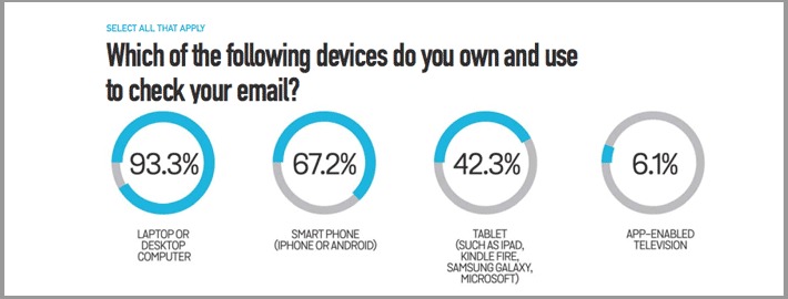
According to BlueHornet, 67,2% of consumers use a smartphone to check their email, 42,3% use a tablet while 93,3% uses desktop environment.
Mistake #4: Not using proper 301 redirects
Let’s imagine you have a well-running shop, but due to some reason, you move your shop to a new location.
Wouldn’t you want that your old customers find your new shop easily?
What will you do then?
You will leave a message on your old shop that your store has been moved to a new location; please visit us at the following address.
That’s we all would do. Right?
Same applies for your new website.
And, if you want your old visitors or clients come to your new site by using old website reference you have to tell them about your new website location.
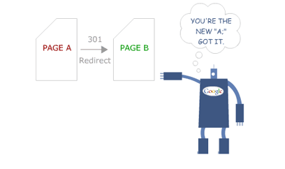
This is where comes 301 redirects into play.
Let’s take a quick look exactly what the 301 redirection is?
Redirection is the process of sending one URL to multiple URLs. Where you send user and search engine to both to a new location instead of the page they request.
There are three types of redirects webmasters use:
- 301 Redirect (Moved Permanently) Best for SEO
- 302 Redirect (Found or Moved Temporarily)
- Meta Refresh
301 Moved Permanently – 301 redirect is a permanent redirection method which passes almost 100% link juice to the redirected page. It is the best to save your SEO ranking.
302 Moved Temporarily – 302 redirects used for a very short period. It passes 0% of link juice to the redirected page, and in most cases should not be used.
Meta Refresh – Meta refresh sends alert to the web browser to refresh the current webpage automatically after a particular period.
Meta refresh passes some link juice, but still, I wouldn’t recommend you to use it.
This redirection method is not recommended for SEO because of its poor usability and chances to lose the link juice it passed.
Mistake #5: Poor website navigation
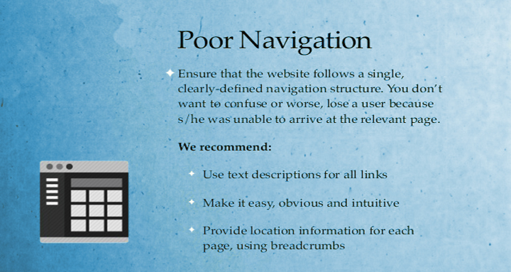
Success and failure of any online business depend on the how well the website’s navigation is.
The design of a website’s navigation has a bigger impact on your business’s success than any other factor.
It affects search engine ranking as well as user friendliness.
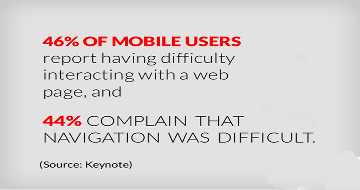
A survey held by Keynote found 46% of mobile users report having difficulty interacting with a web page, and 44% complain that navigation was difficult.
Don’t even think about conversion if a visitor can’t found what they are looking on your website.
Let’s take a look at some common navigation mistakes people make during a website redesign process.
Poor Standard Style – Visitors always presume to find navigation either on the top of the website or left or right.
Using the navigation at the right location make your website easier to use.
Easy navigation leads to lower bounce rate and more visit.
As a webmaster, your goal is to help people to provide them the right information instead of confusing them with poor navigation.

Using common labels – Make sure your website’s navigation labels are catchy. Words like ‘Products’ and ‘Services’ are very common to any business.
People don’t search for the keywords like product or services, and it does connect with your customers directly.
Despite using generic words use powerful and catchy words that save visitors click and reduce bounce rates.
See below the quicksprout blog how well they have defined their services:
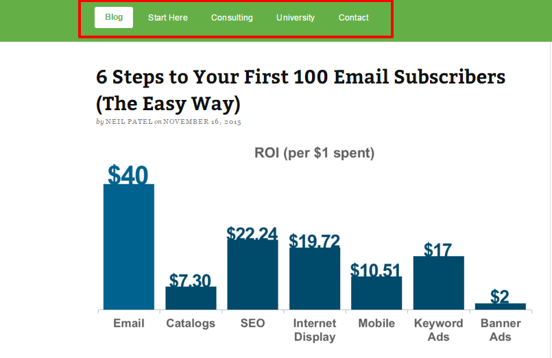
A site converts better if it shows products besides using words like products or what we do, etc.
Your navigation plays a major role in website’s conversion.
Drop down menus – I will give you two reasons why you should not use a drop down menus.
First, it’s bad for SEO because search engine crawler does not find it easily.
And the second one is serious. A study of Nielsen Norman Group found that drop down menu is annoying.
As a visitors, our eyes moves faster than a mouse to find what we are looking.
When you visit a website, in your mind you already decide what items you have to click on.
But when you click on the drop down menu and see more option it’s obvious your mind gets divert in other direction.
Drop down menu encourage visitors to skip important pages.
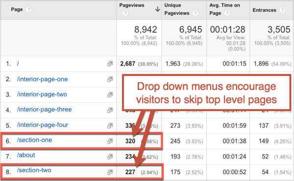
If your site has drop down menu, you can see in your analytics pages under drop down will have high bounce rate.
Multiple items in navigation – Do you know that short term memory holds only seven items?
Therefore, if your site has more than seven links on your website’s, you are already leaving lots of money on the table.
Multiple items can confuse to your visitors.
On the other hand, fewer items on your website allow your visitors to decide what they want.
A case study by Visual Website Optimizer showed how Taloon.com, a Finland-based hardware e-commerce store increased their conversion rate by 11.9% on their product page by removing social share buttons.
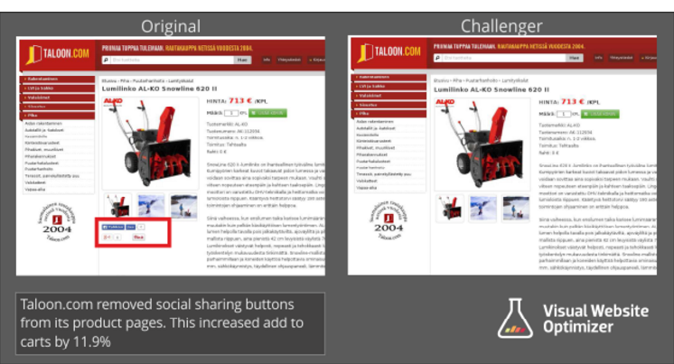
Limited navigation on your website is also important for your website’s SEO.
Mistake #6: You forgot SEO site audit

SEO site audit is necessary for your website, and it provides you a comprehensive report of errors, bugs, and other factors that could cause poor performance of your site.
An SEO audit helps you to make an error free website and avoid silly website redesign mistakes as well as helps you find out strengths and weaknesses of your website.
To keep that in mind many companies hire SEO agencies to perform expert SEO audit for their website.
Those SEO agencies charge them a good amount of money to do an expert SEO site audit.
However, you can do SEO site audit on your own.
There are plenty of websites that lets you perform an SEO audit for free.
- SEOptimer – It is a free online website that lets you do SEO site audit for free.
- Raven’s website audit – Raven is a popular software service provider. You can check out its SEO website audit software for free 30 days after that you have to pay for it.
- My Site Auditor – My site auditor is another great website for SEO website audit, and it is free.
- SEO Site Checkup – SEO site checkup is also another website audit tool which you can use for free of cost.
- WooRank Website Review – SEO Tool – This is the best online free website audit tool. It provides you a detailed report of your website’s performance and errors.
Mistake #7: You forgot to check site analytics
Never forget to check your analytics before redesigning or migrating. Analytics will provide you details of your well-doing landing page, top content, and referring sites.
It will help you to understand about the most visited pages, top landing pages and the pages have most referring links.
Export all your top performing landing pages that are performing well before you start redesigning a website. Thus, when you migrate your website, those URL does not change.
However, Google Analytics only allows exporting 500 web pages.
But if you have more than 500 web pages on your website, Screaming Frog is the tool you can use to export all your web pages.
Once you have all your web pages and landing pages, you can use them in your new website.
Mistake #8: You forgot to setup webmasters accounts
It is one of the deadly website redesign mistakes I see people do.
They often forget to set up webmasters accounts on their new website.
However, Google and Bing both provide the webmaster tools that you can use for free.
Moreover, Webmaster setups are not hard you can do it by yourself.
All you have to do it create an account in Webmaster Tools, submit your website and verify it, that’s it.
Following are some benefits of using webmaster tools.
- Access to search statistics on search engines
- Latest data about incoming traffic and internal links
- Receive notification directly from Google and Bing if your site has any issue like malware, crawl errors, etc.
- Shows keywords that people are searching to find your website. You can use those keywords to your content or landing page URL.
- You will get direct message “Your Site May be Hacked” from Google if your site security is critical
- You can set location targeting to get targeted traffic from a particular location.
If you are redesigning your website or migrating, you can tell Google that you are moving to a new location.
You must use both Google and Bing webmaster tool to monitor your website’ health, traffic and other important factors that could be helpful to run your new website after redesign and migration.
Mistake #9: You didn’t create sitemap
Let me tell you the importance of a sitemap and why should you have it?
Moreover, it informs search engines immediately if any changes happen in your website.
But, what if it does not provide correct information?
Yes, you heard right.
It happens, webmasters often make this deadly website redesign mistakes.
They neglect the importance of sitemap and forget to create a new sitemap for their website.
Here are some common issues which people face during website redesign and migration.
A new sitemap is not created – You must create a new sitemap after website redesign or migration. Add it to a new website, and submit it to Bing and Google Search Console (Previously known Google Webmaster.)
Using old sitemap – Using an old sitemap in your new website can lead the following problems.
- The search engine will not be able to understand your website’s structure
- Your ranking could be down
- Any URLs that present in your old sitemap does not exist or redirect to a new location could negatively affect on your ranking.
Your sitemap is not using the correct form – If your website has moved to a secure server HTTPS or vice versa, then your sitemap should consider this changes and represent the correct format.
Since Google announced HTTPS is also a ranking factor, many sites have migrated from HTTP to HTTPS.
Therefore, it is important for webmasters to use correct format to ensure, search engines easily able to crawl your website.
Final Thoughts!
It is a good decision you are redesigning your old website or migrating it to a new domain.
But, make sure you avoid the silly website redesign mistakes that hurt your website’s search engine ranking and kill your conversion.
Avoid SEO mistakes as much as you can during a new site launch or migration.
As you can see, there are several factors that you need to care of while redesigning your website.
Let us know if you are also facing or have faced any issues after redesigning your website.


Hey Umesh,
A website revamping can be really tricky to many. The chances of making the mistakes are higher than anyone can think. I like the way you have elaborated about the concept of the blueprint. It makes sense.
You can’t even start designing if there is no clear vision. If you’re messing around with a live website then you would need to maintain the SEO.
The navigation is required to manage the way which can improve the user’s experience. There shouldn’t be anything clingy. Everything should be easy to access.
Thanks for mentioning the posts and this informative article.
Have a great week ahead.
~Ravi
Ravi Chahar recently posted…Things To Keep In Your Mind When You Hire A Web Designer.
Hey Umesh
I just say this is amazing post. Then focus all those this in future day. thanks for sharing this.
Hey Umesh,
That’s a great post. I will be sharing the things on social media.
Thanks for sharing.
And have a good week ahead.
Thanks Robin for sharing this post. 🙂
Hi Umesh,
I think broken link caused the most harm when it comes to website redesign. It not only lowers your website credibility but also is bad for your search engine rank.
Hamza
Thanks robin for sharing such an informative post and providing tips for website redesigning process..Very wonderful and amazing post
hey umesh
nice to see such an informative post i would like to share it with others also… good keep it up budy (y)
the biggest mistake i usually do when it comes to redesign a website is “forgetting setup of analytics and webmaster tools”
i put the ad code in theme options and when it is changed, it is gone.
you have said that very true..
Thanks Umesh Singh for sharing these web designing facts. All the mentioned mistakes are understood. Considering this article, we can easily avoid these mistakes. Thank you again for sharing this.